
Graphic and digital works that exemplify strong analytical and creative design methods. The following are selected as samples from a wider variety of works. For a full portfolio review, please visit the contact page.
The landing page for Abode Homes allows users to quickly and effectively navigate the site and build desired selections or select from existing communities.
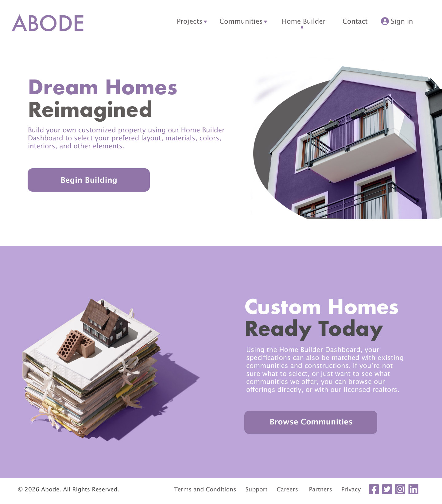
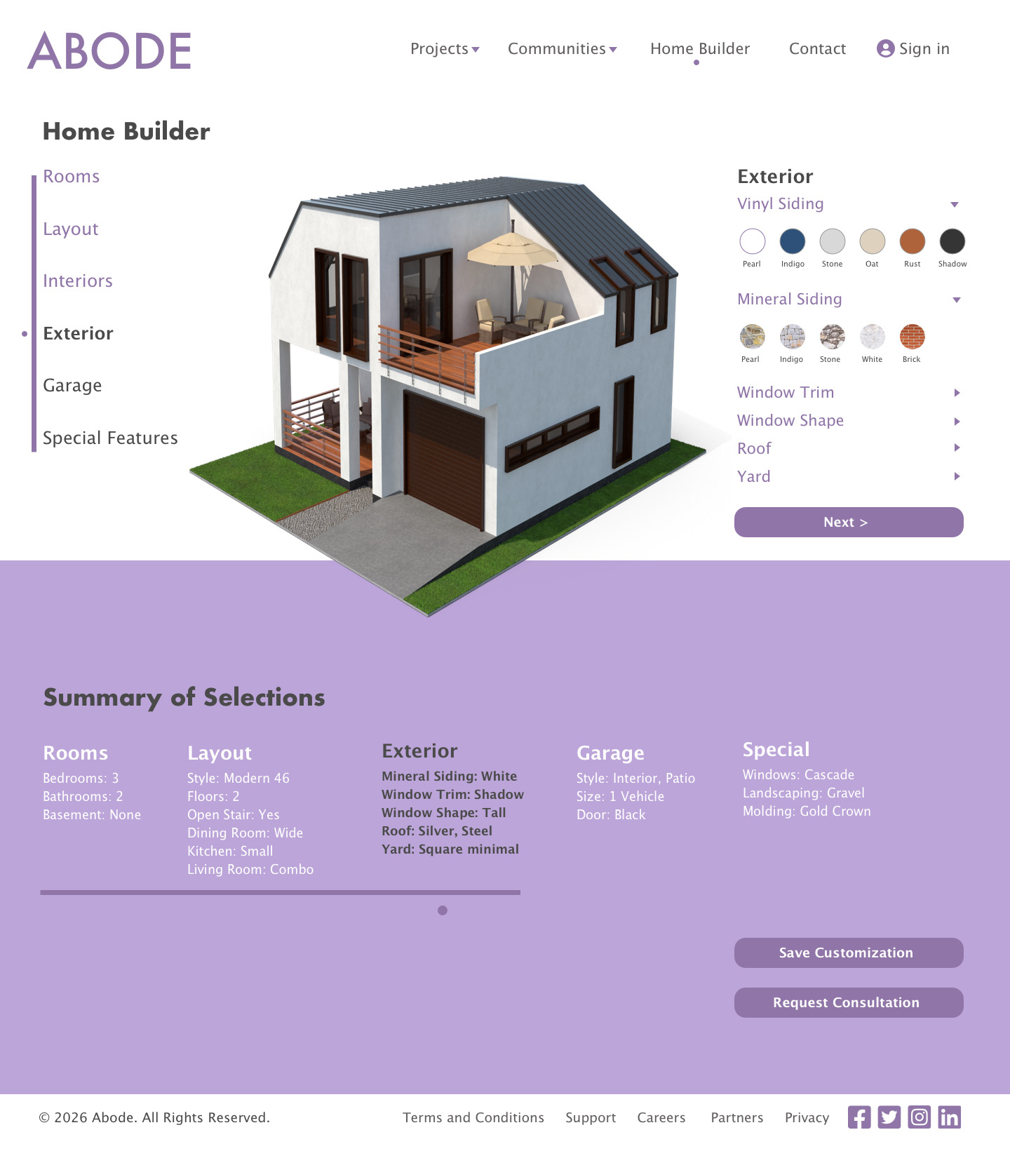
The designed branding, web page, and home customization dashboard for Abode Homes allows users to quickly and effectively navigate the site and build desired selections. The site offers a 3D render with clickable selections to provide an engaging and impactful user experience to build their dream home.
Sullivan technology's website sample features metrics from the past thirty days for systems and web page visits. The design is intended to integrate the necessary data quickly for the viewer in a clean, organized user experience.
 >
>
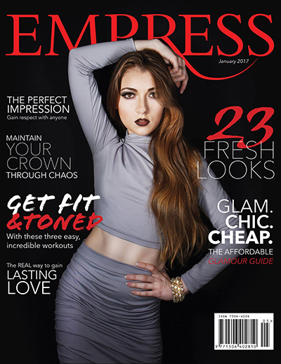
The cover for Empress Magazine. Original photography, editorial layout design, and branding design. All elements are correlated to fit the theme for the target audience. Content planning and structural organization of all features included cover story creation, branding integration for current and future platforms, and photographic direction (through self portrait feature) for complete execution. Select the image to view entire sample.
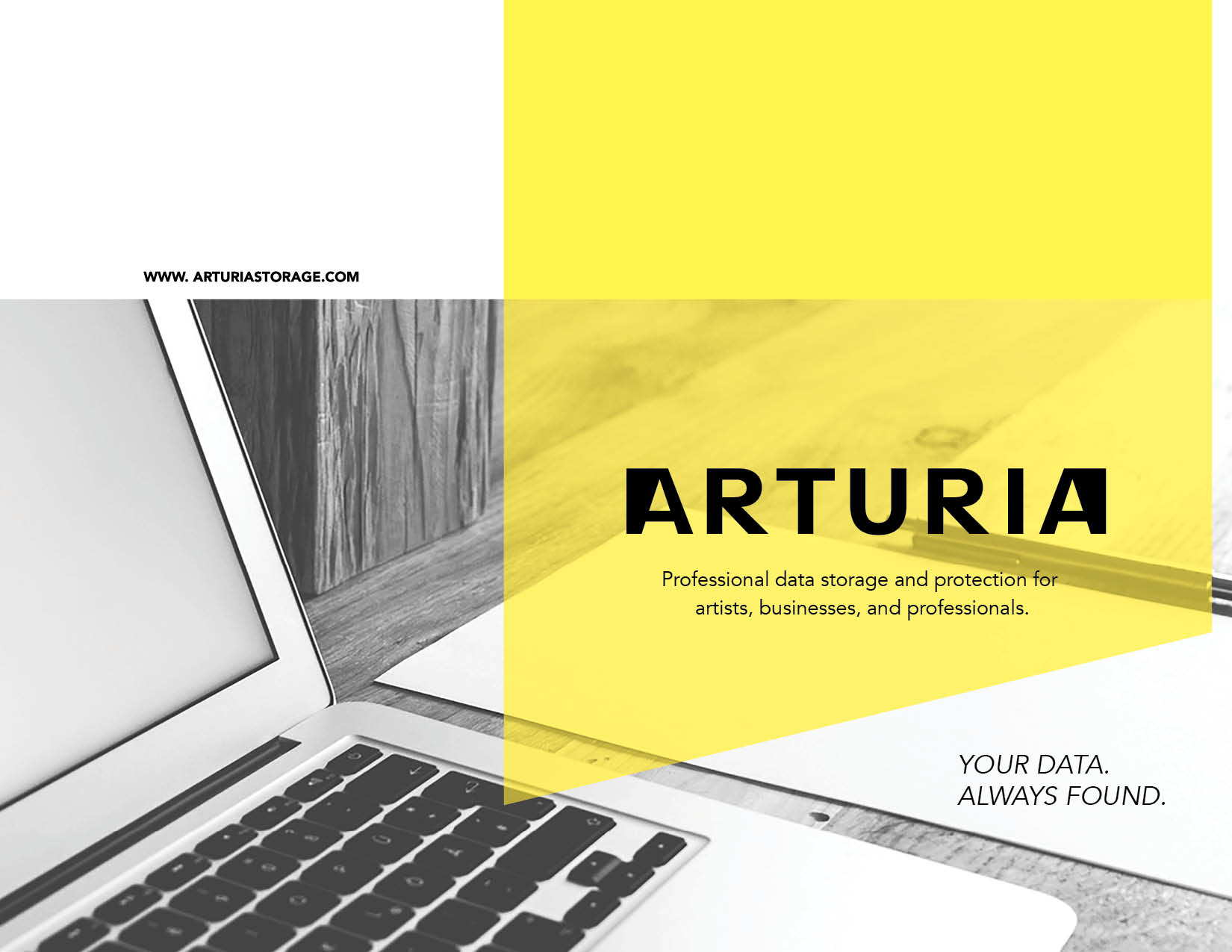
This promotional booklet provides a designed overview of a data storage and protection company's offerings. The design applies clean, concise marketing design to quickly engage the client and communicate the services in an impactful, organized way. Click the image to view entire booklet sample.

This brochure, created for a boating rental and supply company, demonstrates a design of motion and clarity for the viewer. Though static in presentation, the viewer gains a sense of movement and excitement while understanding the refinement of the company identity. The piece organizes and defines a large quantity of information in clean manner for the most successful consumer impact.
Table of Contents for Empress Magazine. Original branding demonstrating versitality and design integration. Editorial layout displays contents in a cleancut, yet engaging manner.
This design incorporates the original branding design for Volpe Financial Services to create a clean-cut, professional, easy to navigate interface for a financial company. Icons were created using methods of vector drawing, equilateral scale, and consistent stroke width for a clear, navigatable user experience.
This advertisement utilizes original branding and uses photographic manipulation to incorporate the created logo on a bottle. Further photographic editing and manipulation produces an eye catching display of the product.
The design for the oceanic environmental initiative, Ocean's Reach. A cool, pastel color pallet was used along with soft user experience to convey the caring, yet formal outreach of the organization. The user can quickly donate, partner, or gather information about recent accomplishments and news while maintaining an efficient experience with the interface.
 >
>
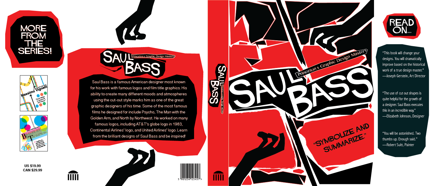
This is one of three covers that were created for a series. The design emulates the style of the artists himself, using cutout designs and high contrast to interest the reader.
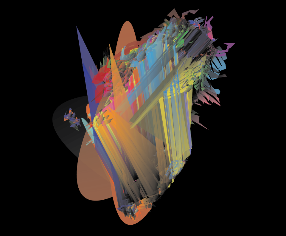
This multifaceted, dynamic composition displays the energy of abstract emotions associated with creative thought and the design process itself. Both curvilinear and harsh lines combine to create this conceptual visual.